
Nala Comex
corpo brand development
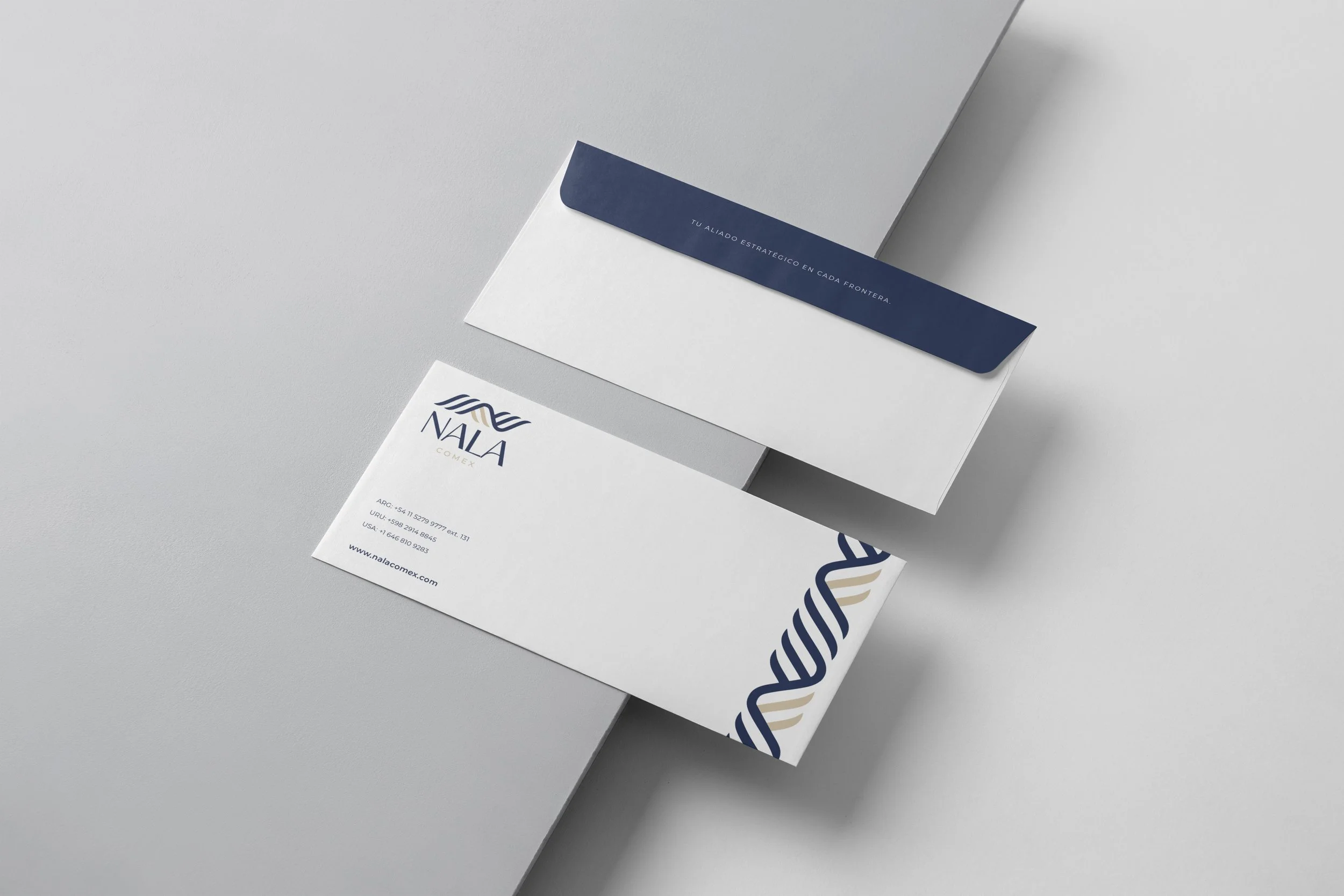
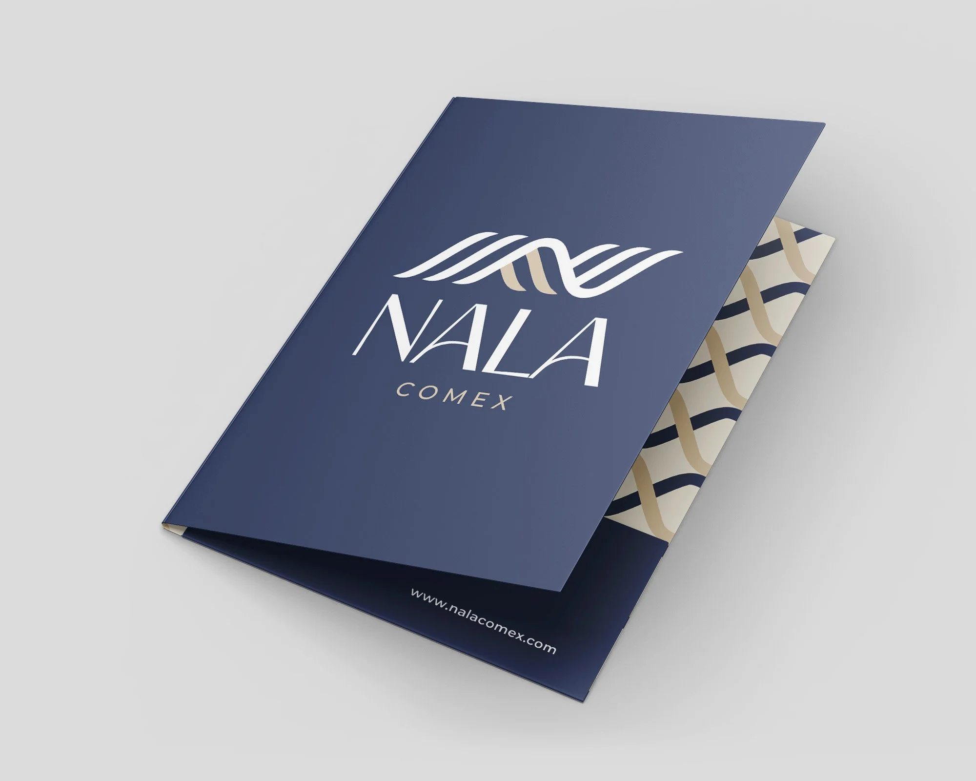
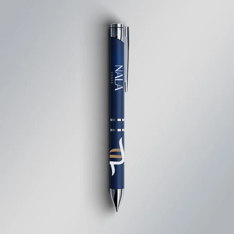
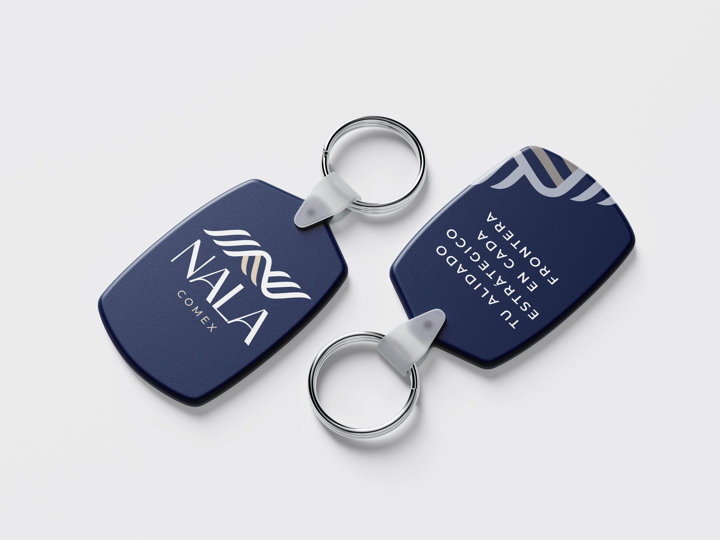
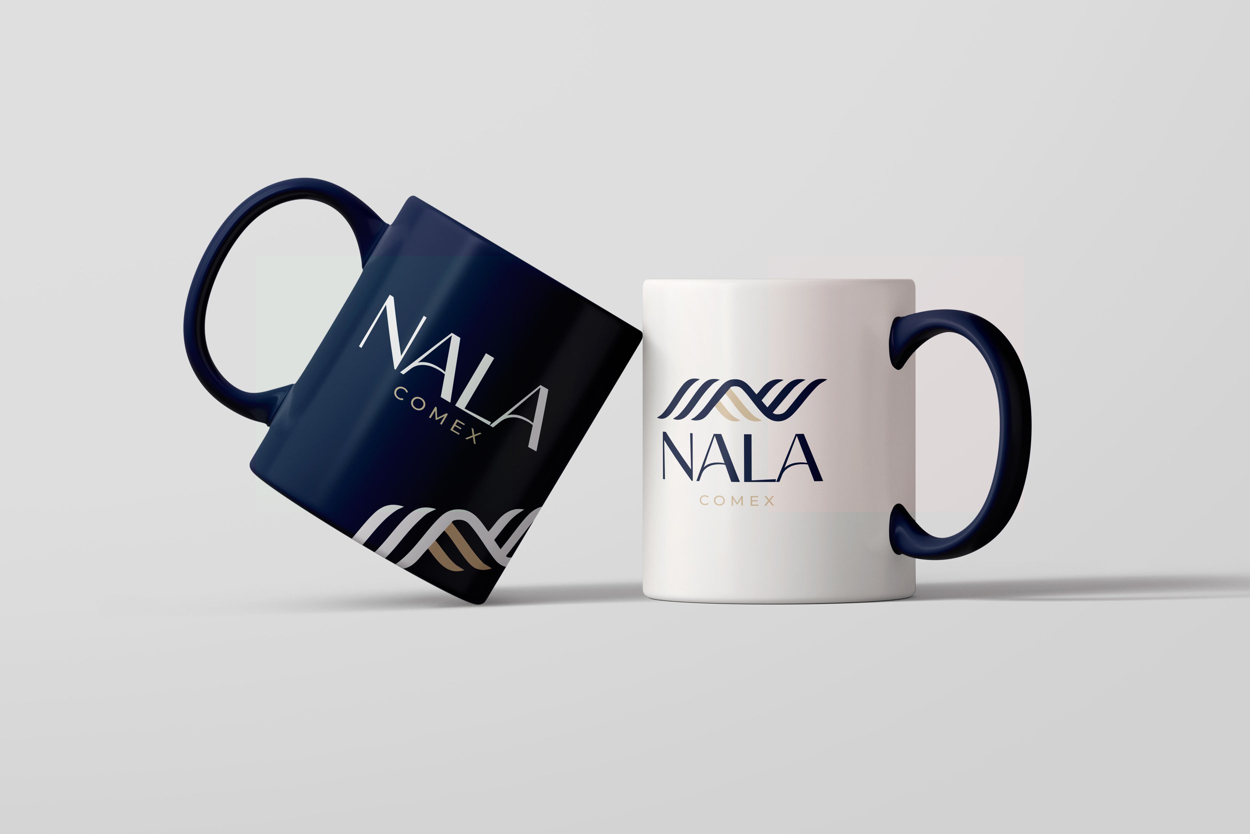
A corporate identity system developed for NALA Comex, an international trade and logistics company. The project focused on creating a professional, trustworthy, and scalable brand presence across corporate communications, digital platforms, and branded merchandise.
CORPORATE BRANDING · VISUAL IDENTITY · DIGITAL ASSETS · MERCHANDISING · 2025
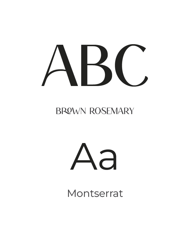
03 Typography
A modern typographic system that balances professionalism, clarity, and strong corporate communication.
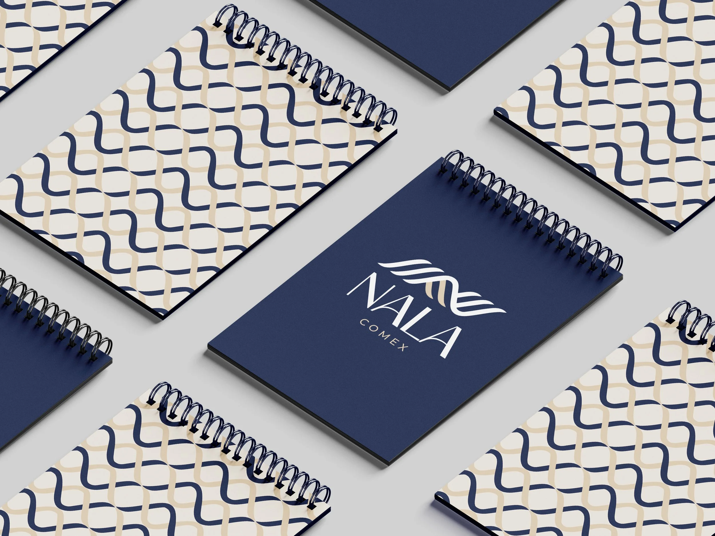
04 Patterns
Supporting graphic elements provide flexibility while maintaining a cohesive and recognizable visual language..

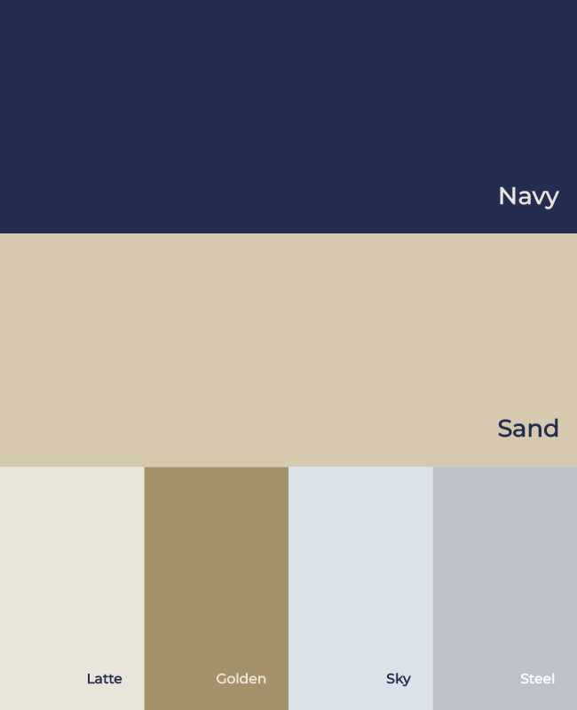
02 Color Palette
A combination of navy blue and warm neutral tones reinforces trust, stability, and a global business mindset.
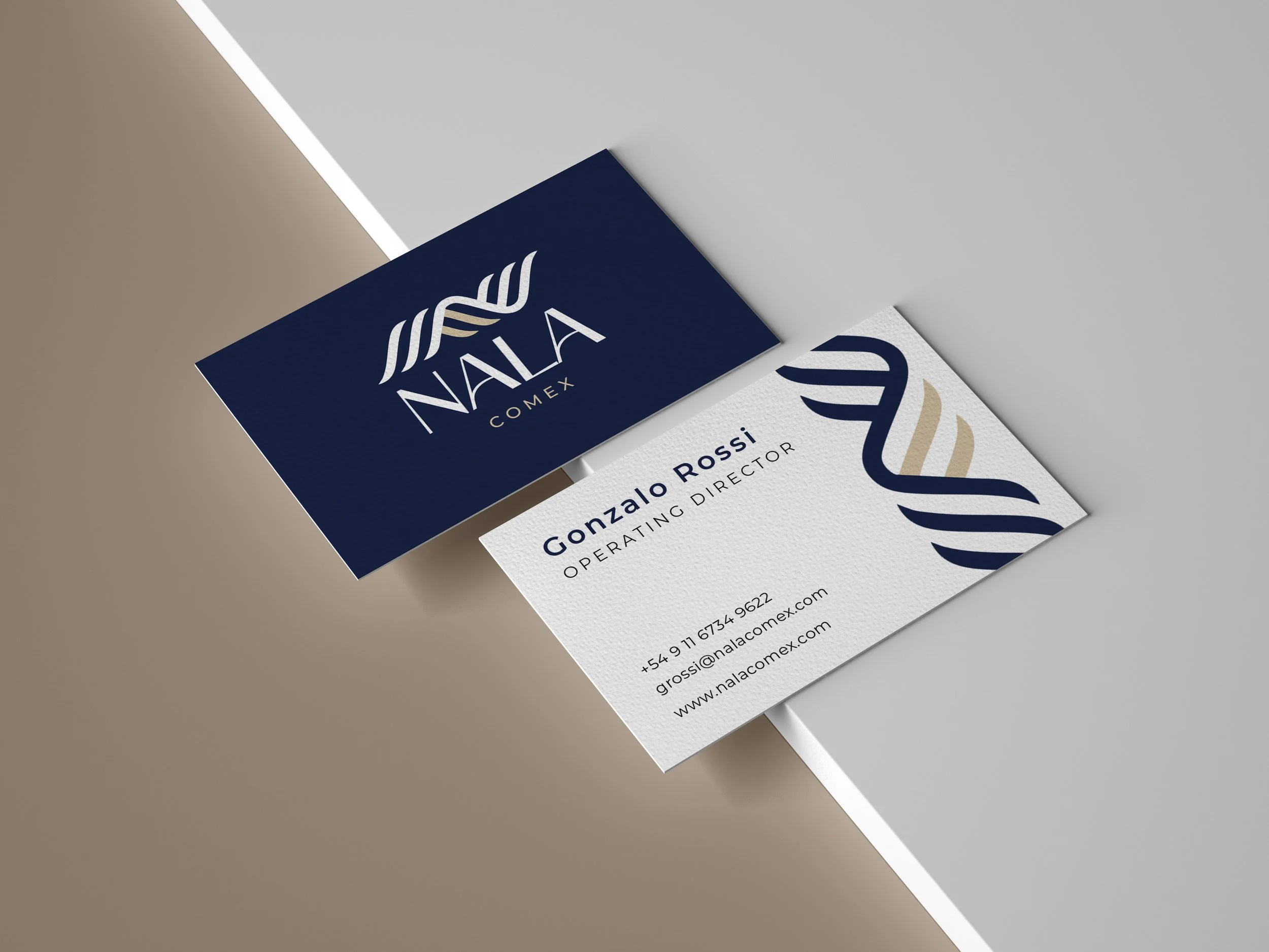
01 Logo
A clean and professional logo system designed to communicate reliability, efficiency, and global reach.


Client: Nala Comex | Location: Buenos Aires, Argentina | Year: 2025
Scope: Corporate Branding, Visual Identity, Stationery Design, Digital Assets, Merchandising
Tools: Adobe Illustrator · Adobe Photoshop
All visual work shown in this case study was created by Victoria Argüelles for Nala Comex as the client. All rights to the final deliverables belong to Nala Comex. Work is shown here for portfolio purposes only.